U.S. vs. Eurozone GDP
February 17, 2014 § Leave a comment

Economists closely watch the quarterly change in gross domestic product as a sign of a country’s economic well-being. A contraction (aka negative economic growth) in GDP for two consecutive quarters is the technical indicator of a recession.
Here’s the catch: the U.S. and Eurozone calculate the quarterly change differently. If you want to chart the figures together one set needs to be recalculated.
The details:
The U.S. expresses its GDP figures as a quarterly change at a seasonally adjusted annual rate, or what the quarterly rate would be if it continued for four quarters. The Bureau of Economic Analysis does this to make it easier to compare a quarter’s rate to rates in previous years. The Wall Street Journal chart above is a good example.
The Eurozone expresses GDP as a straight change from the previous quarter, not at an annual rate. See the chart below from the National Post.
If you want to compare Eurozone GDP to U.S. GDP your best bet is to recalculate the Eurozone GDP at an annual rate. I’m not going to step you through it, since the BEA already does an excellent job of it at this link: http://www.bea.gov/faq/index.cfm?faq_id=122. You will need to get the quarterly GDP values (not the percentage changes) to make this calculation.

Investing goals
December 8, 2013 § Leave a comment

Editors and designers of quarterly investor newsletters face the daunting challenge of putting a fresh take on familiar messages. This chart from T Rowe Price offers a new way of looking at asset allocation over time. It tackles the idea with a free-form visualization. Note how the chart hinges on a zero base for when you plan to spend your money and fans out to the left and right to depict years before and after the goal. The chart depicts asset allocations but lets the key handle the sub-asset categories. It’s easy to read and it tells you a lot.
Nuclear weapon inventories
September 23, 2013 § Leave a comment

For charts showing nuclear-weapon inventories, such as the example above from AFP, chartists typically use the Stockholm International Peace Research Institute as their go-to source.
http://www.sipri.org/research/armaments/nuclear-forces
For historical data, you can also try the Bulletin of the Atomic Scientists’ Nuclear Notebook.
http://thebulletin.org/search/feature-type/nuclear-notebook
Also, NRDC’s archive of nuclear data.
http://www.nrdc.org/nuclear/nudb/datainx.asp
While none of these sources are neutral on nuclear weapons, no one questions the reliability of their data.
Union membership
January 27, 2013 § Leave a comment

You can find annual union membership figures on the Bureau of Labor Statistics web site: http://www.bls.gov/cps/cpslutabs.htm.
But the BLS stats go back just a dozen years. If you want to see how far union membership has declined over several decades, try the Unionstats database, which is maintained by scholars at Georgia State University and Trinity University. http://www.unionstats.com
This will take you back to 1973, broken down by various sectors. The database has some categories that I hope to chart in the future, such as union membership by very granular occupation categories, as well as state membership density from 1964 to date.
State gun laws
January 4, 2013 § Leave a comment
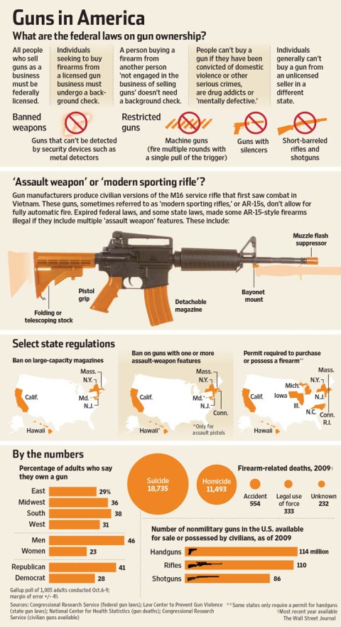
The federal government enforces a few basic gun laws: you generally can’t have a machine gun or a silencer; you can’t buy a gun if you are crazy, you are a gun addict or have been convicted of a major crime; and you have to submit to a background check before you plunk down your money on a shiny Smith & Wesson. Beyond that, it’s up to the states to say whether you can conceal a gun, own super-size magazines or buy a bunch of rifles at once.
You face a mighty challenge sorting out these state laws for your readers with an infographic. I’ve found that the best way is to select your topic first—say, background checks at gun shows—and then compile a list of which states regulate it and to what degree. I used to get this info from The Brady Campaign, but then I discovered that they get their material from the Law Center to Prevent Gun Violence.
The Law Center keeps very good, up-to-date lists of state gun laws. You can find them here: http://smartgunlaws.org/search-gun-law-by-gun-policy/
Racing sheets
December 29, 2012 § Leave a comment
 When I work with reporters on graphics that need lots of text blocks, I tell them to write the copy like a racing sheet: short, punchy, concise and almost exactly the same length from item to item. But not everybody goes to the race track, so here are two examples of racing sheets. Click on them to make them bigger.

Shark attacks
October 7, 2012 § 1 Comment

Shark attacks loom large in our imaginations even though the chance of being killed by a shark is infinitesimally small. Our obsession with shark statistics provides fodder for compelling charts, such as the classic infographic by the Ft. Lauderdale Sun-Sentinal shown above or the more sparse, image-driven chart below.

Visual journalists most frequently go to the International Shark Attack File at the Florida Museum of Natural history for shark-attack data. The site posts an annual report that includes trends by location and circumstance.
http://www.flmnh.ufl.edu/fish/sharks/isaf/graphs.htm
Here are some examples of terrifying details charted in the report.


Another source, the similarly named Shark Attack File, provides less analysis but greater detail on each shark-attack report.
http://sharkattackfile.info
Here’s an example from the National Post of how you can use these stats. The Post’s team created an icon for each recorded attack over the past 100 years.

http://www.nationalpost.com/m/wp/news/blog.html?b=news.nationalpost.com/2012/03/27/graphic-a-hundred-years-of-shark-attacks
West Nile virus
August 18, 2012 § Leave a comment

As I post this, you don’t have to worry much about West Nile virus, unless you happen to live in Dallas County, Tex., where 155 people have caught the disease and 10 have died so far this year. I know this because the Centers for Disease Control and Prevention tracks West Nile virus closely and reports every case where it has been found in mosquitoes, birds, horses and humans.
The Wall Street Journal map above reflects data from the CDC that can be found on this Web page:
http://www.cdc.gov/ncidod/dvbid/westnile/surv&control.htm
If you want to create a more local map or graphic, the CDC goes into greater geographic detail, as you can see from this map on the CDC West Nile virus pages.

Budget authority vs. outlays
July 15, 2012 § Leave a comment

Federal budget documents often show the same spending in two different measures, “budget authority” and “outlays.” As an editor, reporter or infographics journalist, you need to know the difference between the two, or you will waste copious time figuring out which figures to use and why your numbers don’t match everyone else’s. Fortunately, the budget states clearly on every table and spreadsheet whether the numbers are calculated as budget authority or outlays.
So what’s the difference between the outlays and budget authority? Outlays for fiscal 2013 reflect the actual amount of money the federal government will spend in 2013. The outlays figure for 2013 includes some unspent money that was authorized in previous budgets and excludes some spending approved in 2013 that will carry over into 2014 and beyond. Budget authority for 2013 excludes any funding authorized in previous years but includes money authorized in 2013 that will carry over into the future. If you are having a hard time keeping that straight, check out the diagram above, which comes from the budget concepts section of the federal budget, page 138.
http://www.whitehouse.gov/sites/default/files/omb/budget/fy2013/assets/concepts.pdf
So when do you use outlays and when do you use budget authority?
Use outlays when you are referring to the overall size of the fiscal budget for a given year or when you want to show the deficit or surplus.


http://www.whitehouse.gov/sites/default/files/omb/budget/fy2013/assets/tables.pdf
Diffusion indexes
July 9, 2012 § 1 Comment

Diffusion indexes confuse the heck out of people the first time they see one. But once diffusion indexes become familiar, they make a whole lot of sense. To chart a diffusion index and label it properly, you really need to understand what the numbers mean. (Okay, that goes for any graphic, but don’t expect to wing it with a diffusion index.)
With a diffusion index, 50 is the baseline, anything above that indicates expansion, anything below that indicates contraction. What confuses people is this: If the number is 60 in one month and 55 the next, that does not indicate contraction, it indicates slower expansion. If the number is 40 one month and 45 the next, that does not indicate expansion, it indicates slower contraction.
Take a look at the four examples of diffusion indexes in this post. I believe they were all made by Pat Minczeski on The Wall Street Journal graphics team. You will see that The Wall Street Journal took great pains to label not just whether a figure indicates expansion or contraction, but whether it is slower or faster than the previous month.


Usually when you chart a diffusion index, you are looking at some form of purchasing managers index of manufacturing activity. The Institute for Supply Management and Markit provide much of this data. To create an index, ISM surveys purchasing managers and asks them whether they’re doing more, less, or the same of things like placing new orders, hiring people or producing goods. The manufacturing index (or its sub-indexes) reflects their responses.
Here is a link to the most recent ISM report: http://www.ism.ws/ISMReport/content.cfm?ItemNumber=10748&navItemNumber=12949
And here are the historical numbers for the main manufacturing index: http://www.ism.ws/ISMReport/content.cfm?ItemNumber=10752
For detailed historical figures, you probably need to contact the Institute for Supply Management or Markit. I haven’t found detailed figures on their sites. Give me a shout if you come across them.

